The context
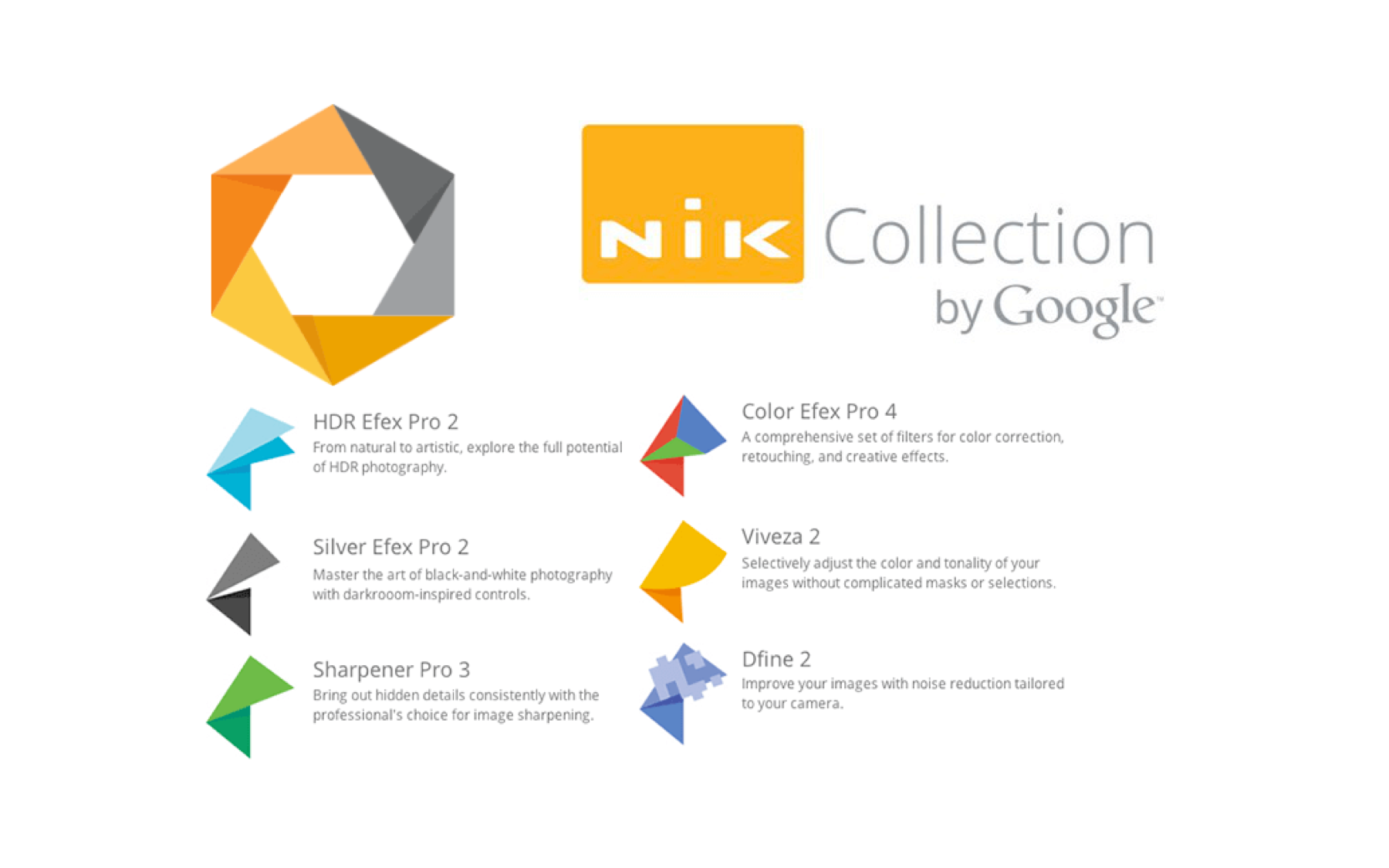
In october 2017, DxO bought the Nik Collection, a popular photo editing software, from Google. The identity of this product was still Google-branded, with an origami style.
The Nik Collection contains 8 different softwares to cover all the workflow of photo editing, from black and white editable presets to denoising. My role was to refresh the identity of the software, to make it more DxO branded, and to give a second breath to a software that hasn't changed in years.
This logo having for objective to be used in serveral digital content, especially webinars and video tutorials, I decided to build it taking into account all the supports and all the usages around it.
First analysis
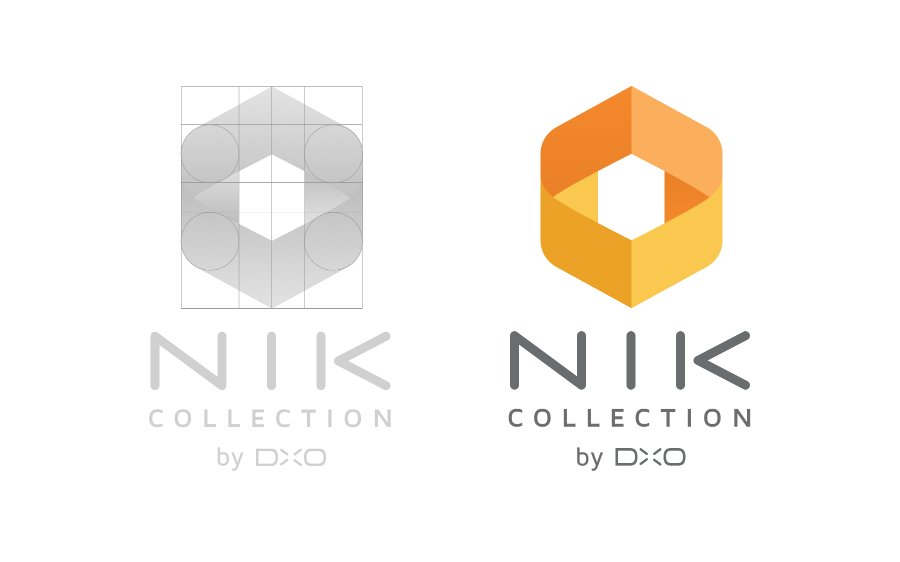
I started by analyzing both the logo and the existing community. From a design perspective, the Nik Collection suite clearly reflects Google’s branding, characterized by its rough edges and geometric shapes. In parallel, we reached out to the user base through a survey to understand, for instance, how they identify the software among all the applications they use—without suggesting any predefined answers. The results showed that users first recognized it by its color, followed by the hexagonal shape.
Redesign step
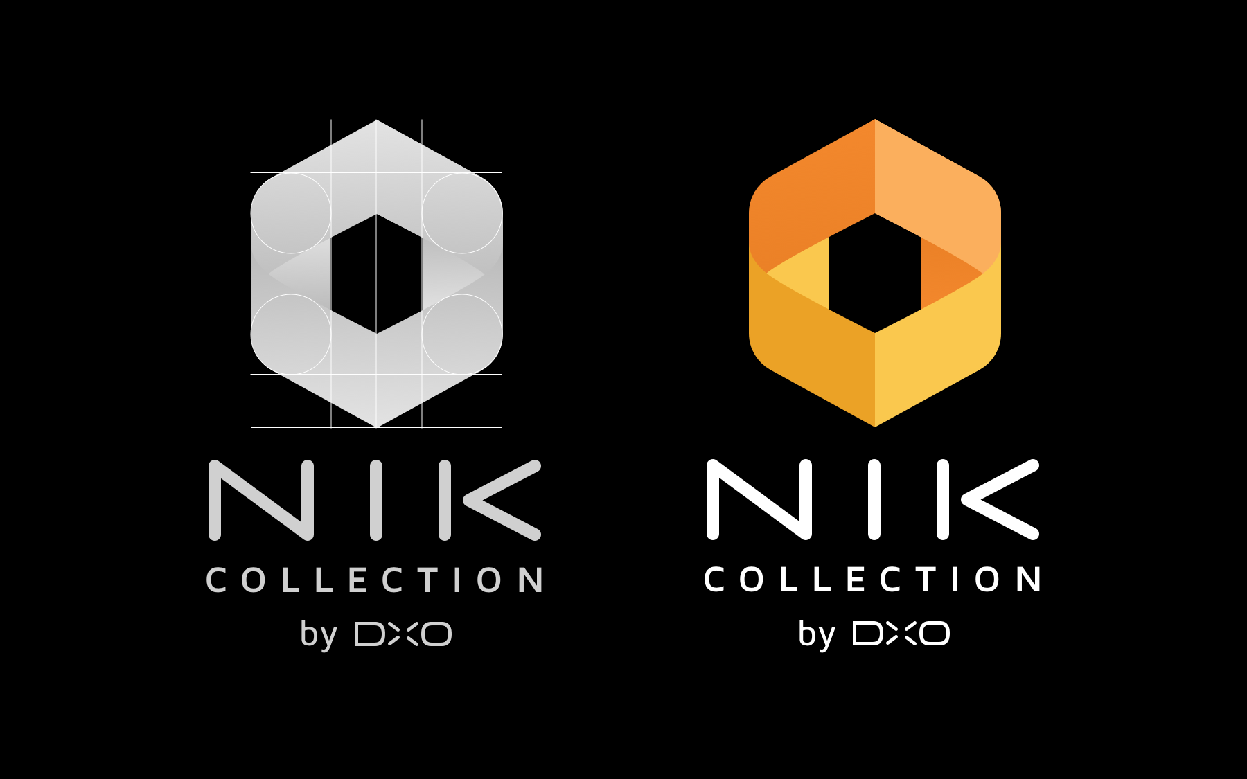
Knowing that, I decided to keep the existing colors, but with a small gradient barely perceptible, but just enough to break the material look of the actual logo. I rounded the borders of the hexagon and gave more depth to the shapes playing with foreground and background layers. I also modified the "Nik Collection by DxO" font to have more consistency with the actual DxO logo.
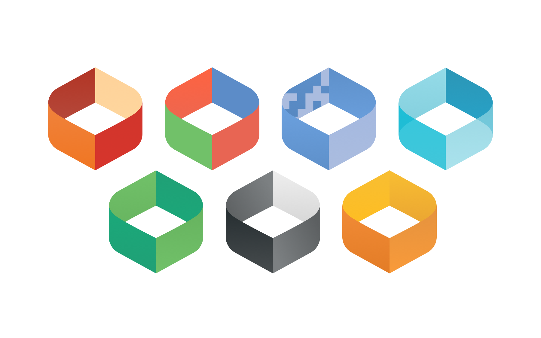
Last step was to decline this logo for all the softwares of the suite, keeping in mind that they need to be easily animated for all the digital use (tutorials, webinars, etc...)