What's Agicap?
Agicap is a Lyon-based fintech building cashflow management software. Originally designed for SMBs, the tool helps companies track and anticipate their cash position. In 2021, following a €100M fundraising round, the company began shifting its focus toward larger, mid-market businesses. As a Senior Product Designer, I led key initiatives, starting with the redesign of the multi-entity consolidation experience and later owning the entire transaction management flow. I also contributed to evolving 🐬 Flipper, our design system, ensuring consistency across the product.
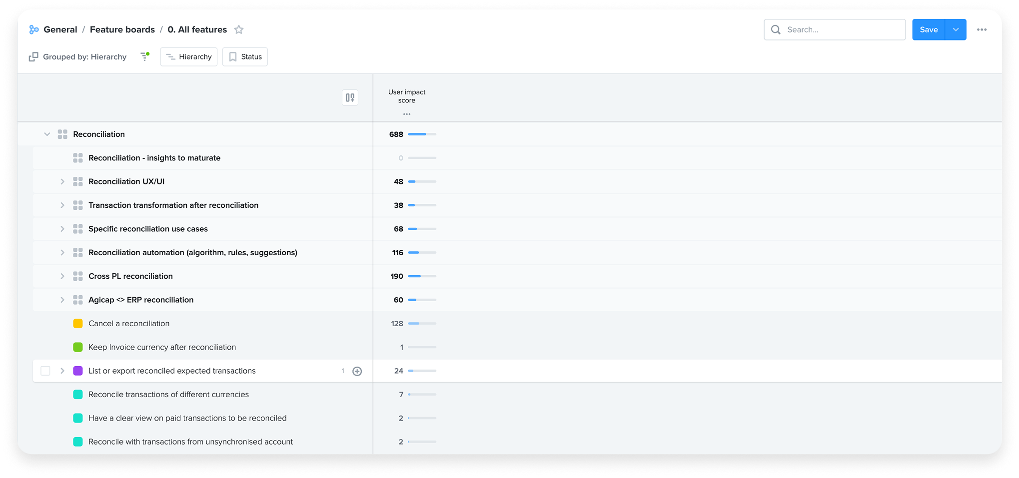
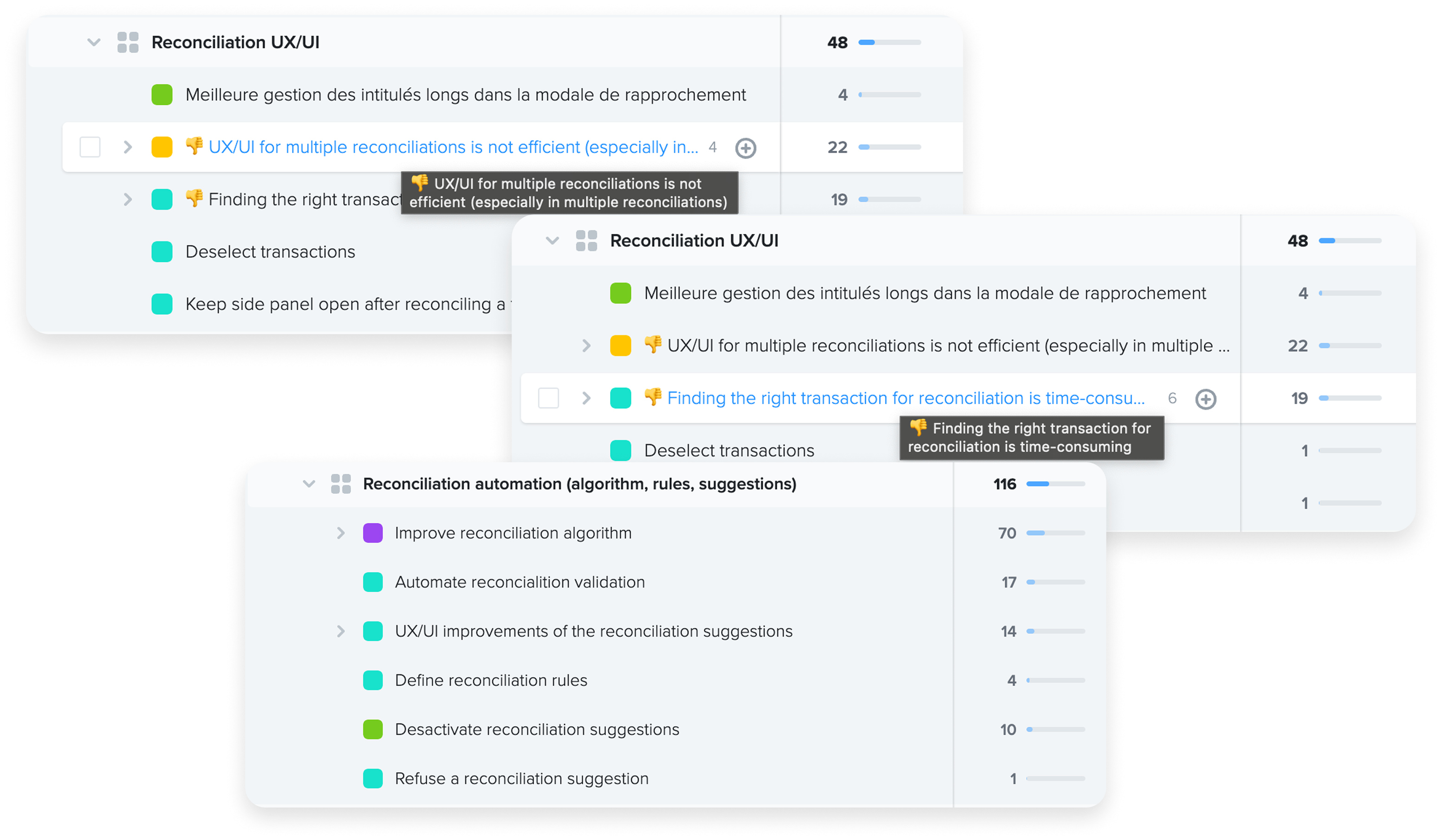
Why have we worked on a new reconciliation?
The issue was flagged in Productboard, our user feedback tracking tool, where input comes from Account Managers, Sales, Product Managers and Designers, and anyone in close contact with customers.
The impact on the company’s outlook was significant — we were losing one out of every two deals, and the situation in the Spanish and Italian offices had become critical, nearing closure. This was tied to an estimated monthly loss of €100,000.
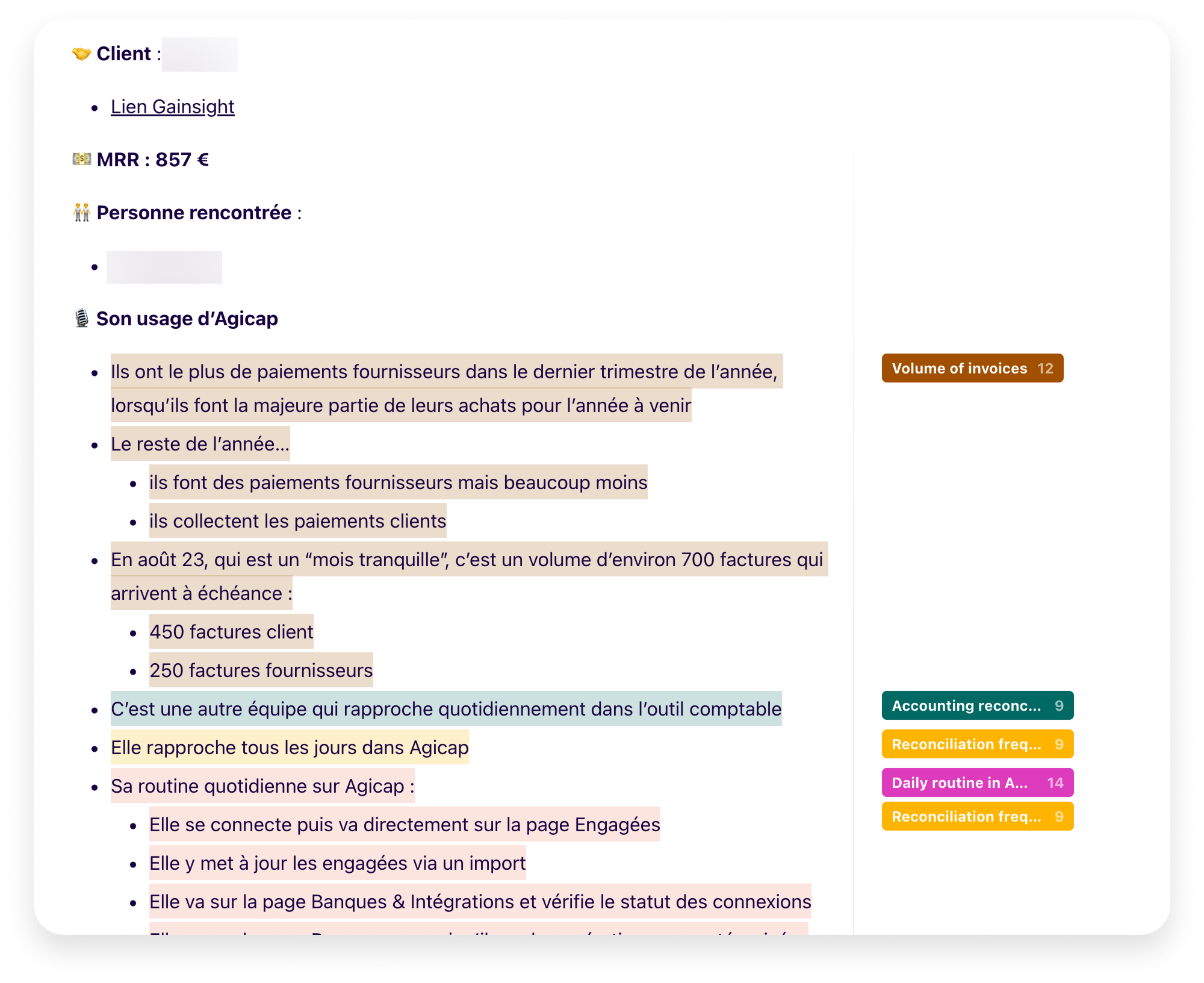
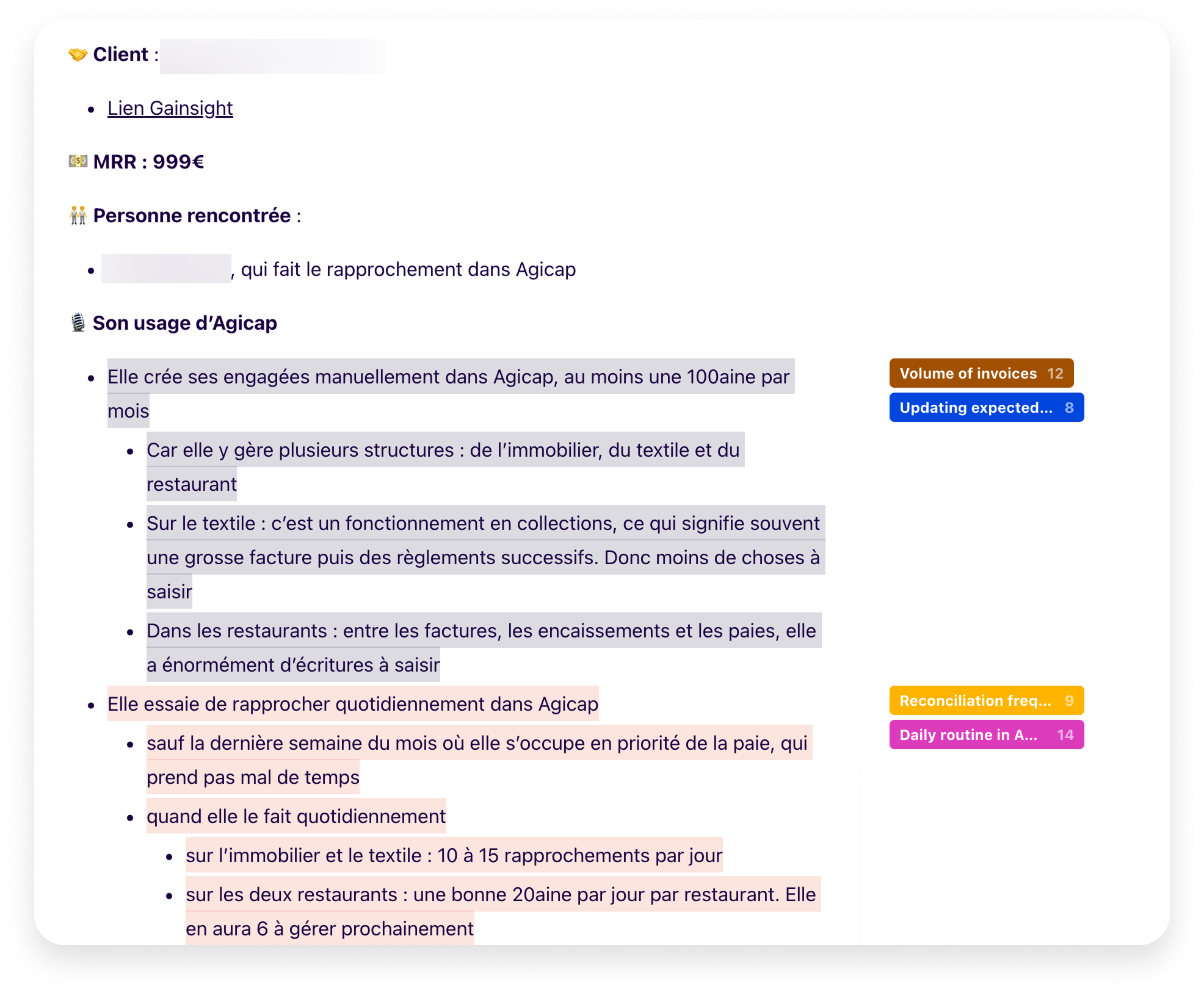
Discovery phase
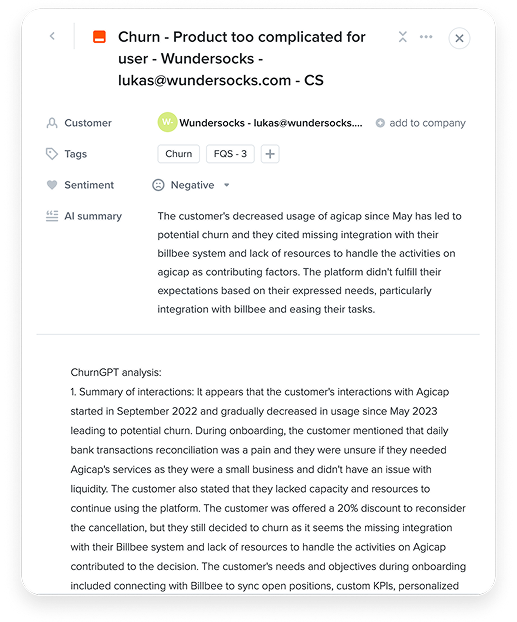
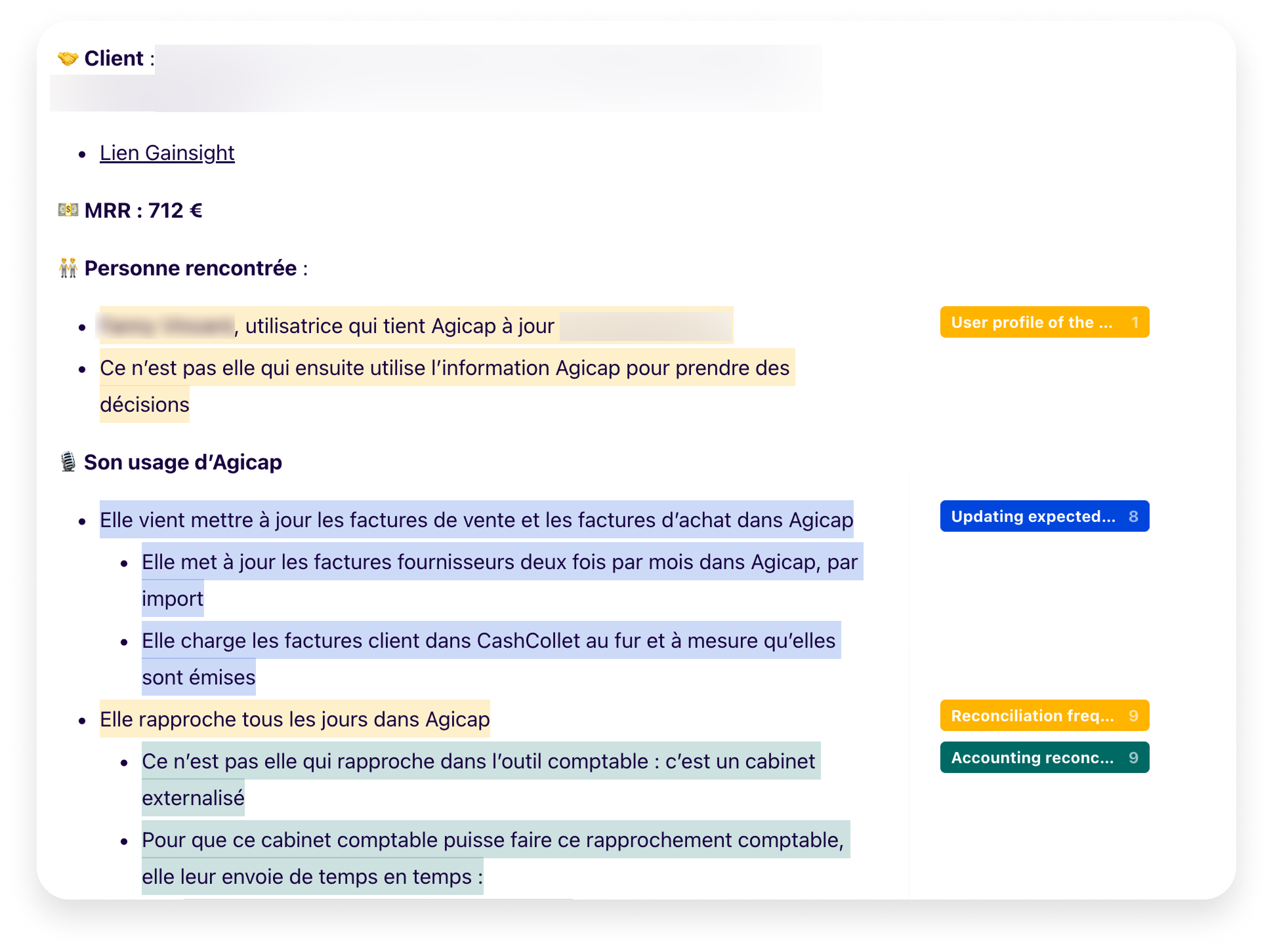
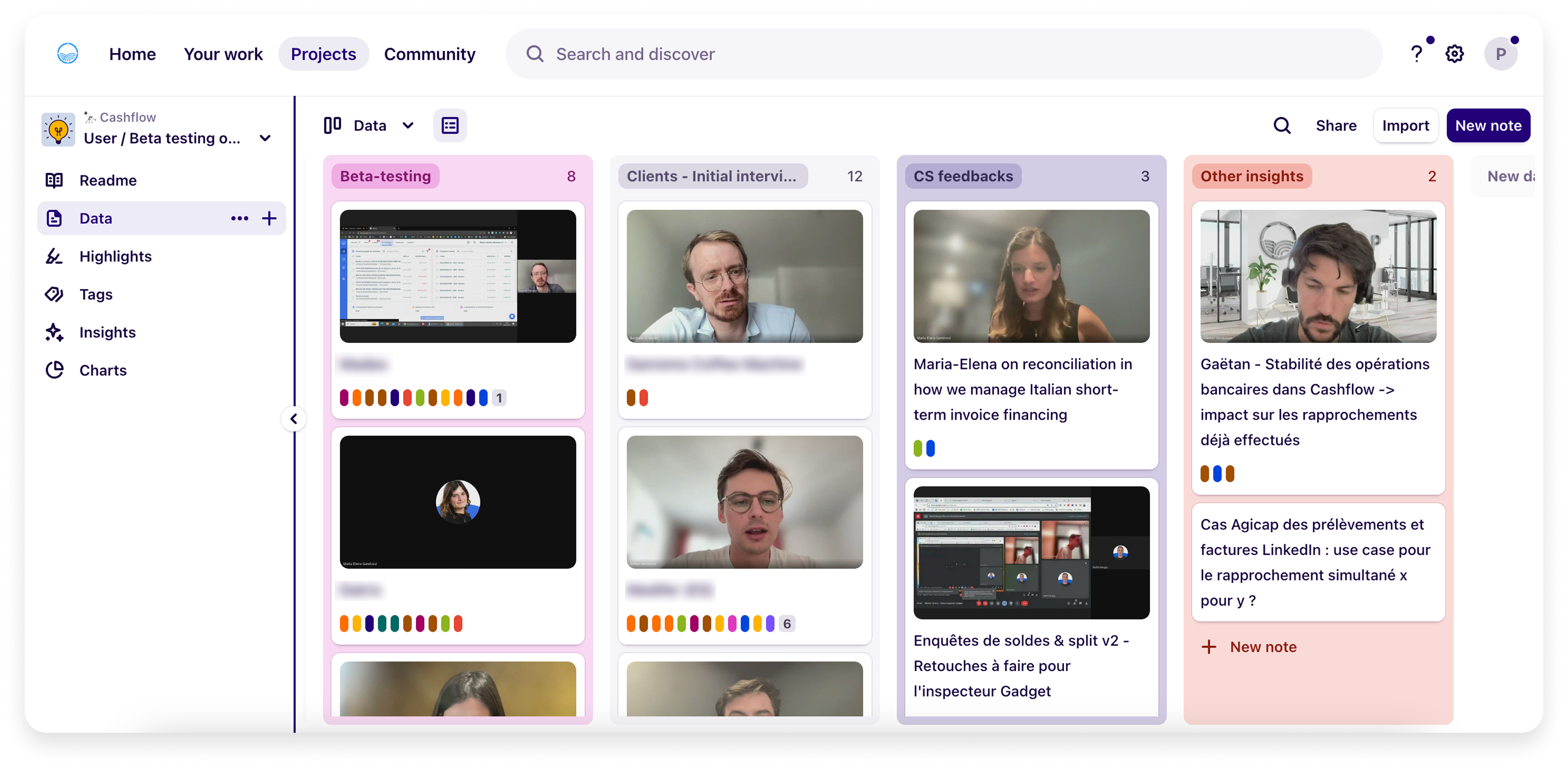
To better understand the frictions faced by mid-market users, we analyzed feedback from Sales, Customer Success, and ProductBoard, and conducted interviews with high-potential leads lost during the sales process. Here are a few insight summaries I created in Dovetail, our platform for tagging and organizing user research.
First iterations
Given the time constraints and taking into account these insights, I began designing screens using the existing design system. This enabled me to present the designs to stakeholders and clients during the second user testing phase, helping them visualize the direction of the project and see tangible progress. At the same time, it provided a solid foundation for feedback, while keeping in mind that some aspects would evolve throughout the process.
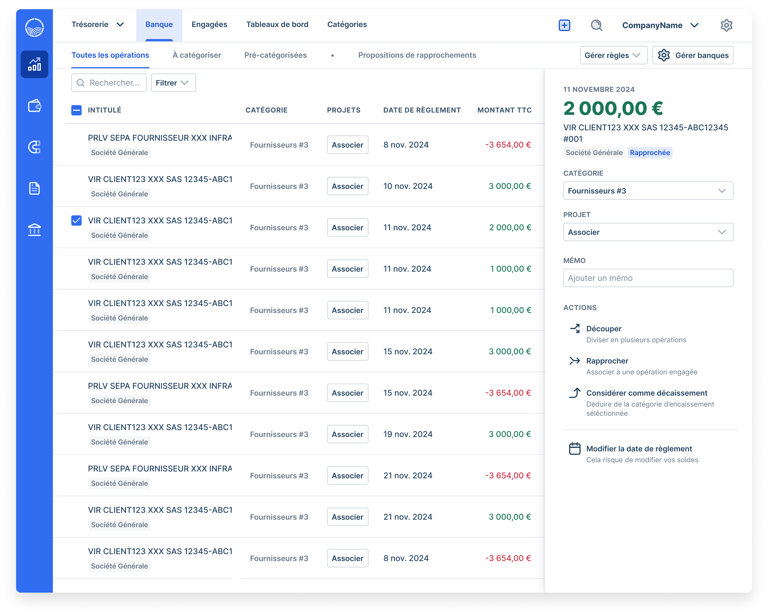
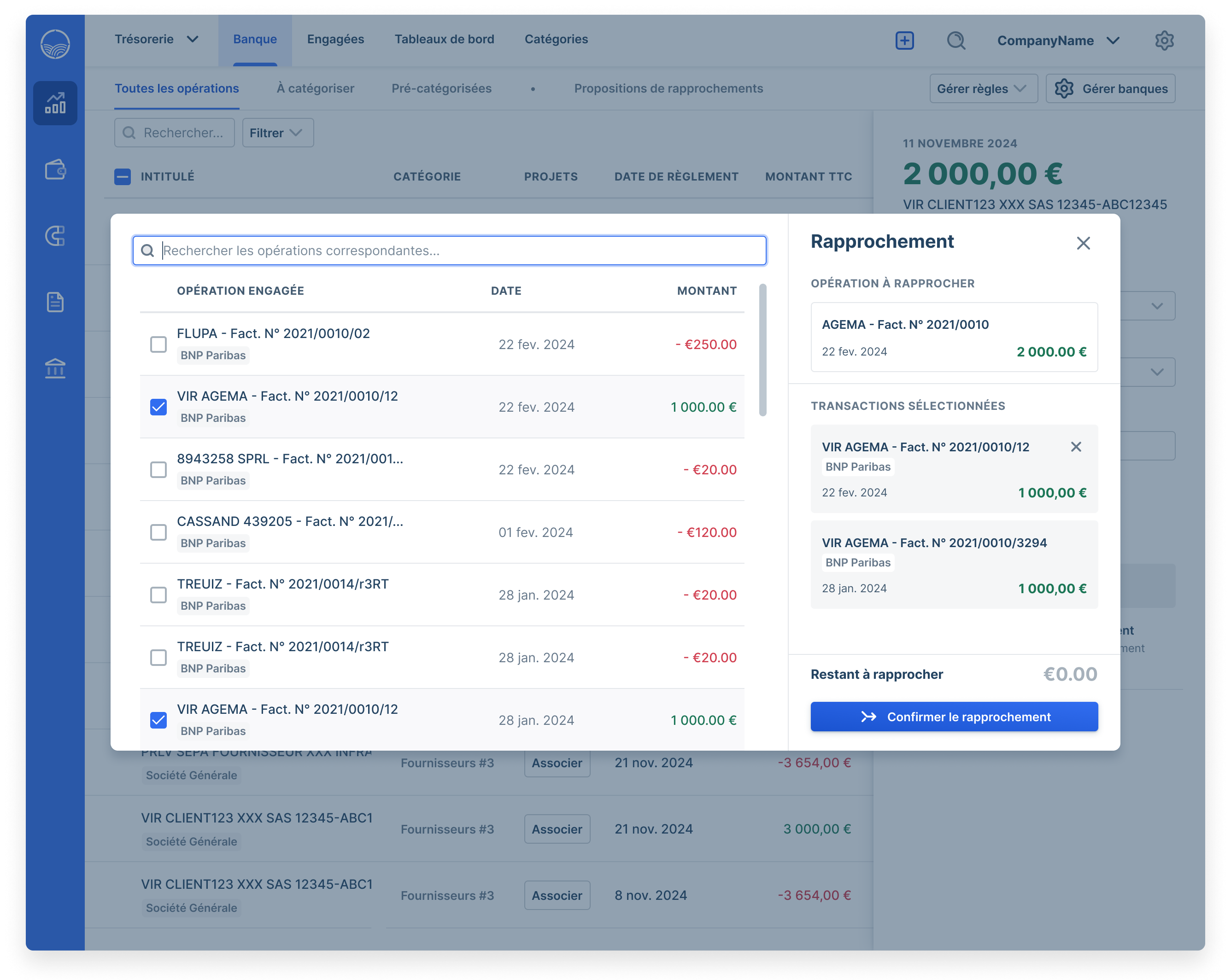
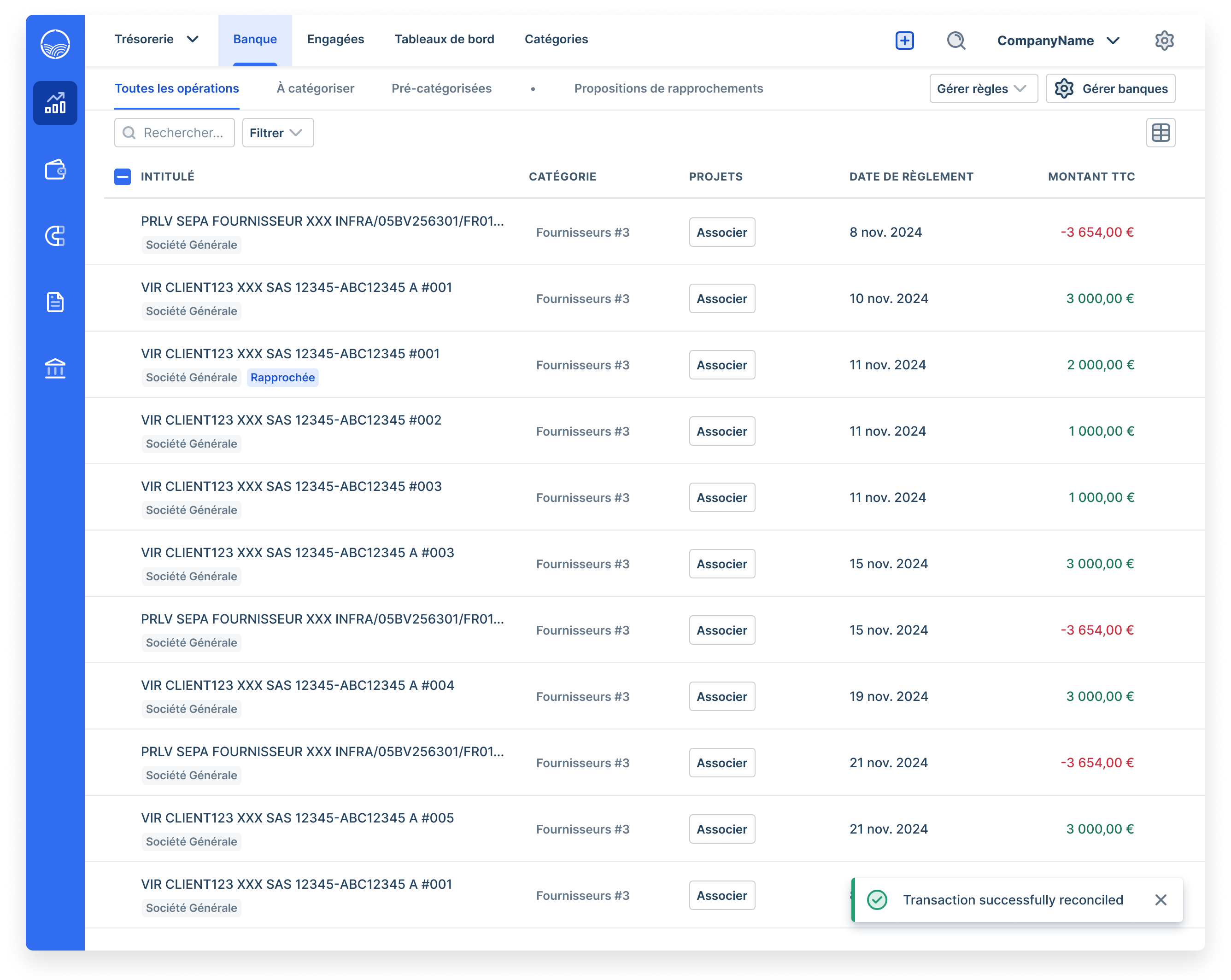
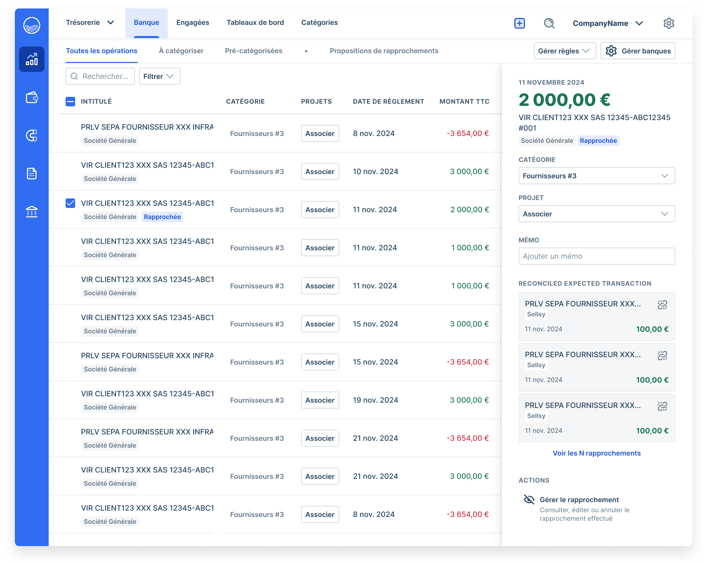
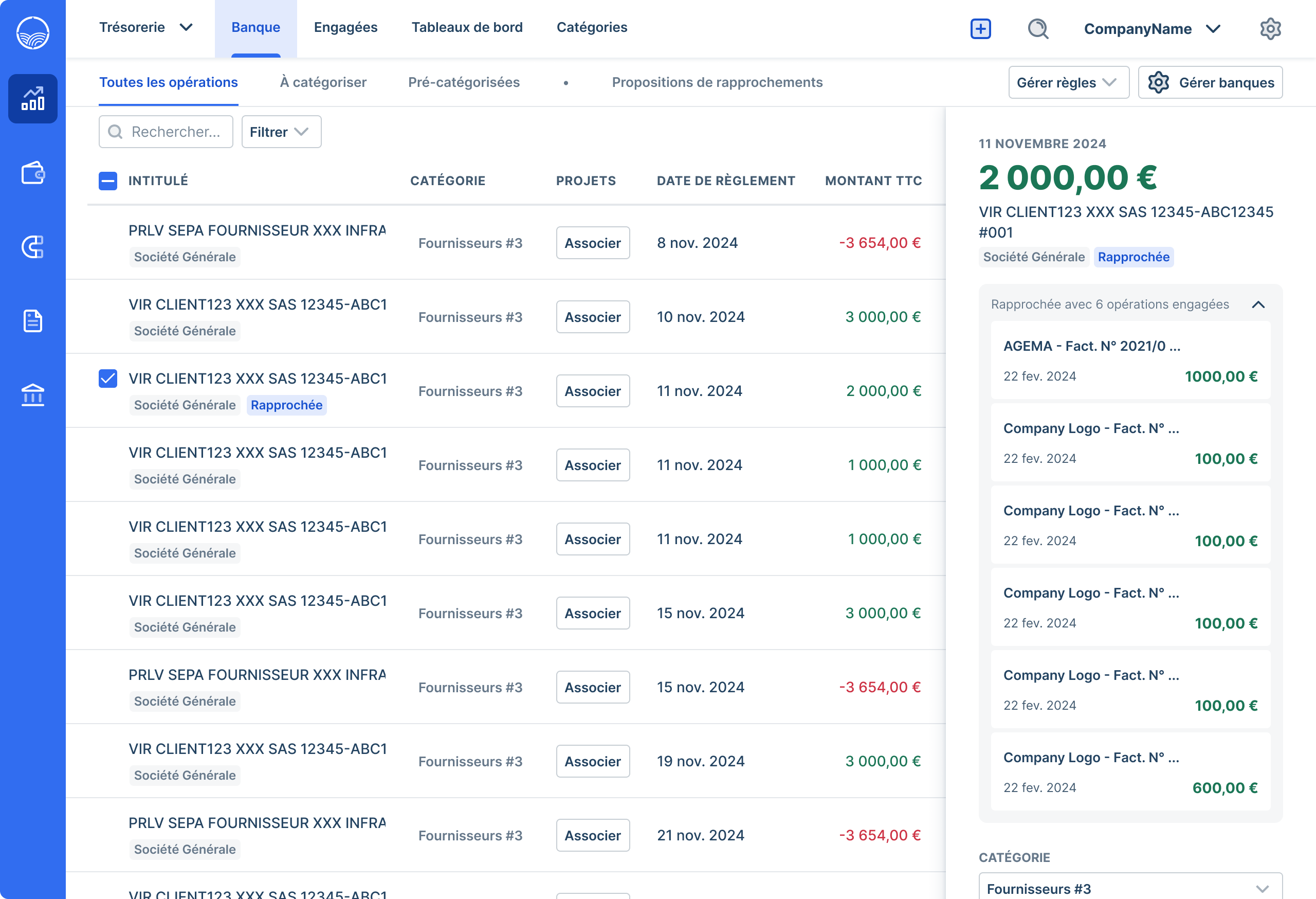
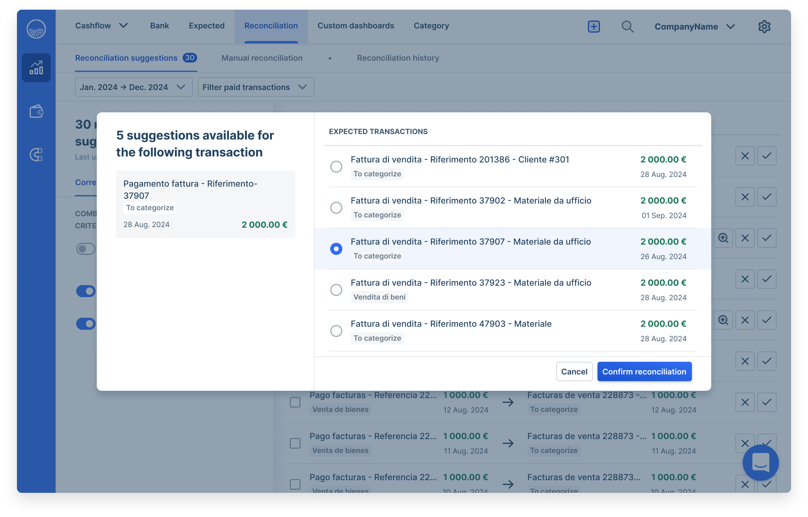
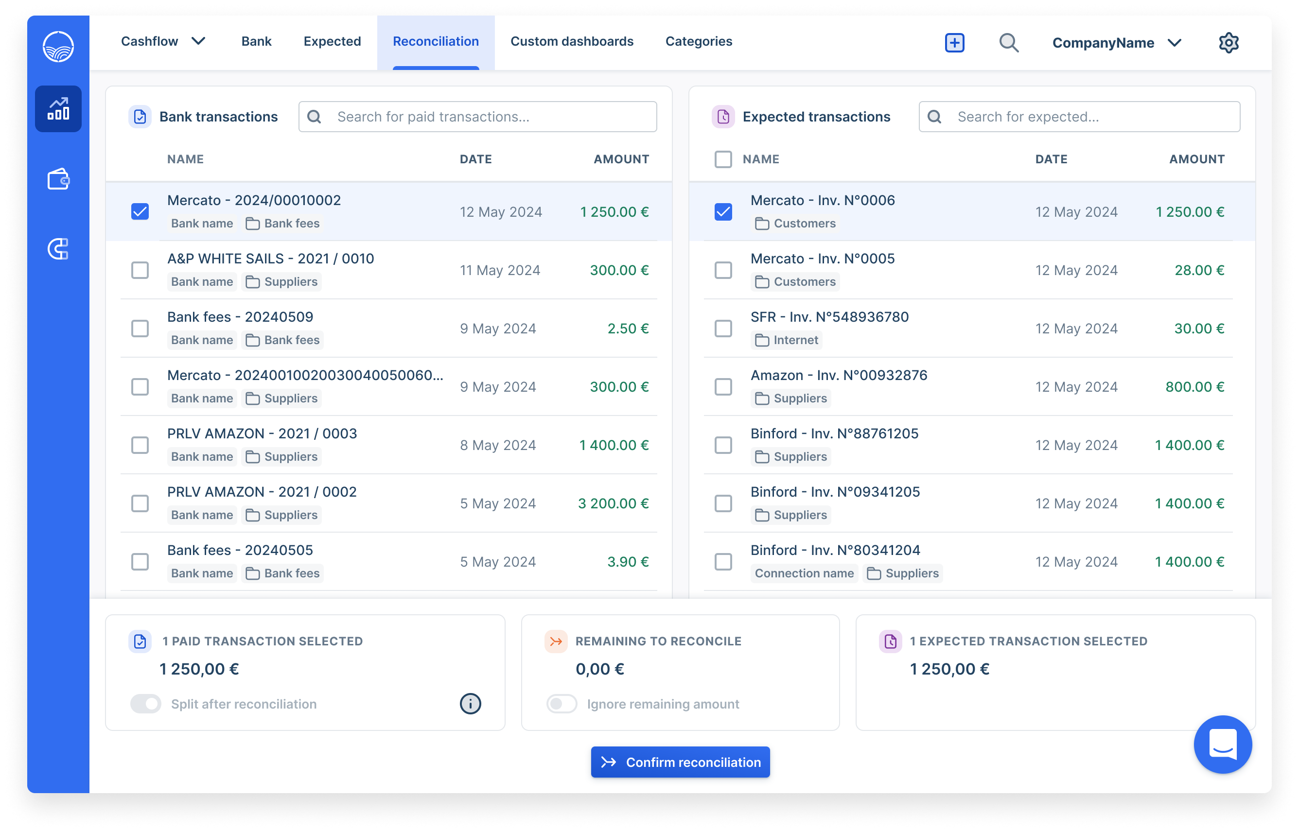
To keep things simple — and because the side panel is a familiar pattern on this page — we decided to keep the reconciliation option within the side panel, triggered when clicking on a paid or expected transaction. Given the complexity and legacy nature of the reconciliation experience from a technical perspective, the first step was to migrate the dialog to the design system and clarify the existing reconciliation flow.
Our design system included a new dialog variant with a side panel, already used in Agicap’s Payments product line. To move quickly, I chose to reuse it — it offered a clear structure, with a transaction list on the left and a summary panel on the right.
Defining MVP
Given the time constraint and urgency to address a major sales blocker, we decided to focus first on delivering a Minimum Viable Product. Working closely with PMs and engineers, we identified the essential features that would bring immediate value and unstick key deals, while deferring less critical improvements to future iterations. We tested and validated this initial version with users, then quickly moved it into development to start improving the feature right away.
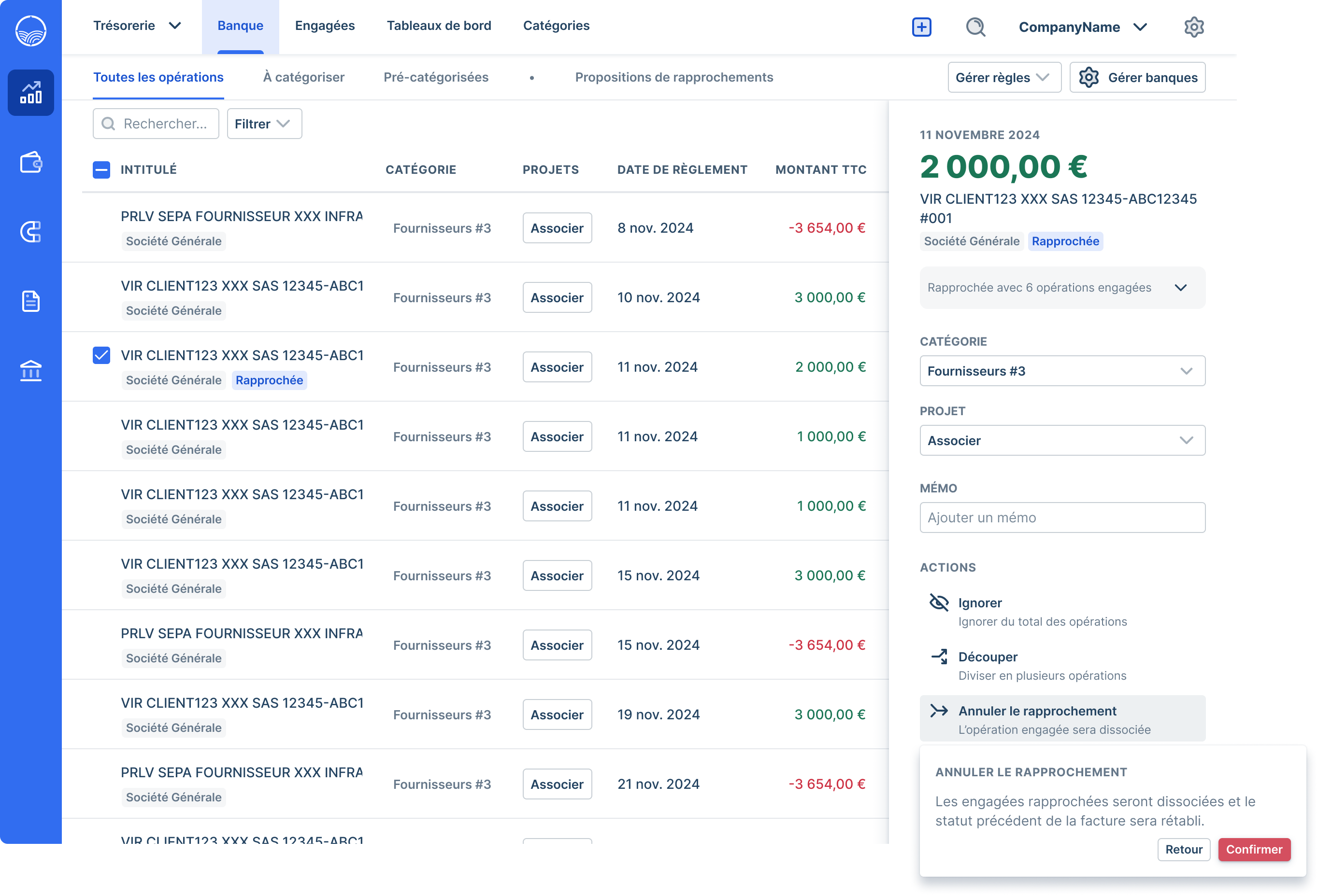
One of the first insights we gathered was that clients were very happy to be able to cancel a reconciliation — but rarely needed to edit it. That’s why, once a reconciliation is completed, the “Reconcile” button turns into “Cancel reconciliation,” with a short confirmation message to prevent mistakes. It was also a great opportunity for me to document our dropdown confirmation pattern for future use.
Looking beyond the MVP
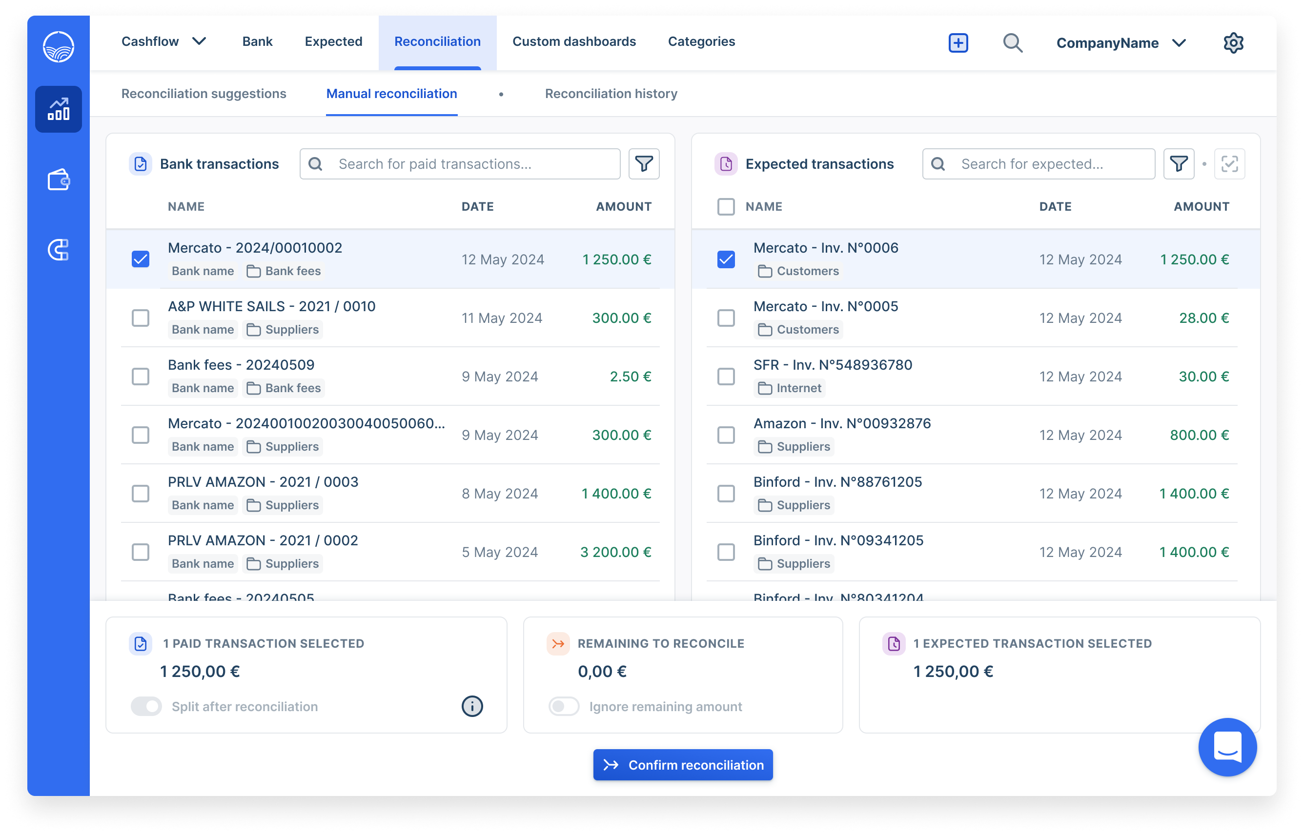
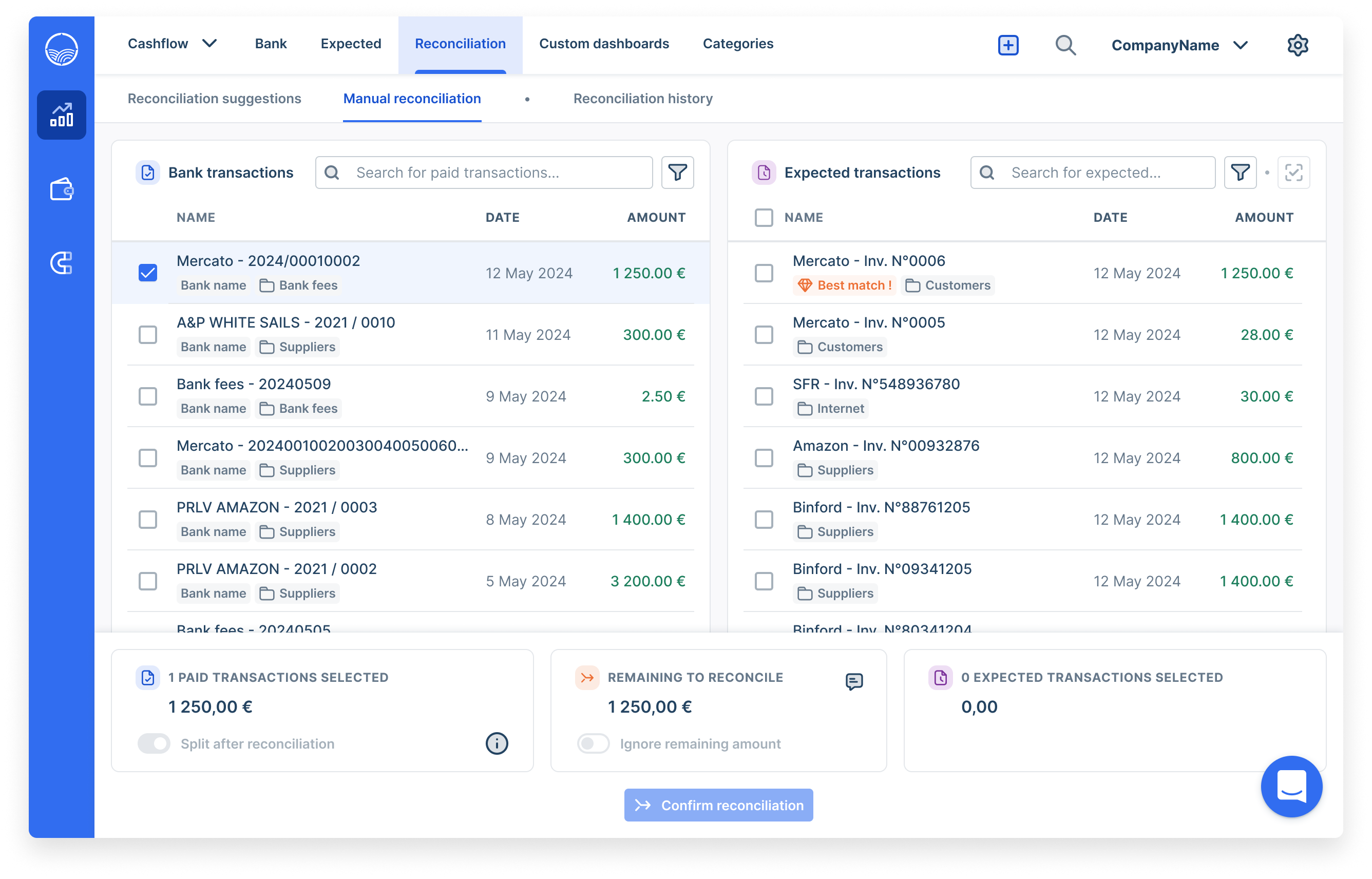
While the MVP allowed us to address urgent user needs and unlock critical deals, I also explored longer-term opportunities to streamline the reconciliation experience. This involved rethinking flows, scaling batch actions, and aligning with the evolving capabilities of our algorithm — laying the foundation for a more robust and future-proof solution. In the long-term track, the idea was to dedicate a full page to reconciliation — a direction driven by user feedback. Some clients spend several hours a day on this task, and having a dedicated space would better support their workflow and help them stay organized.
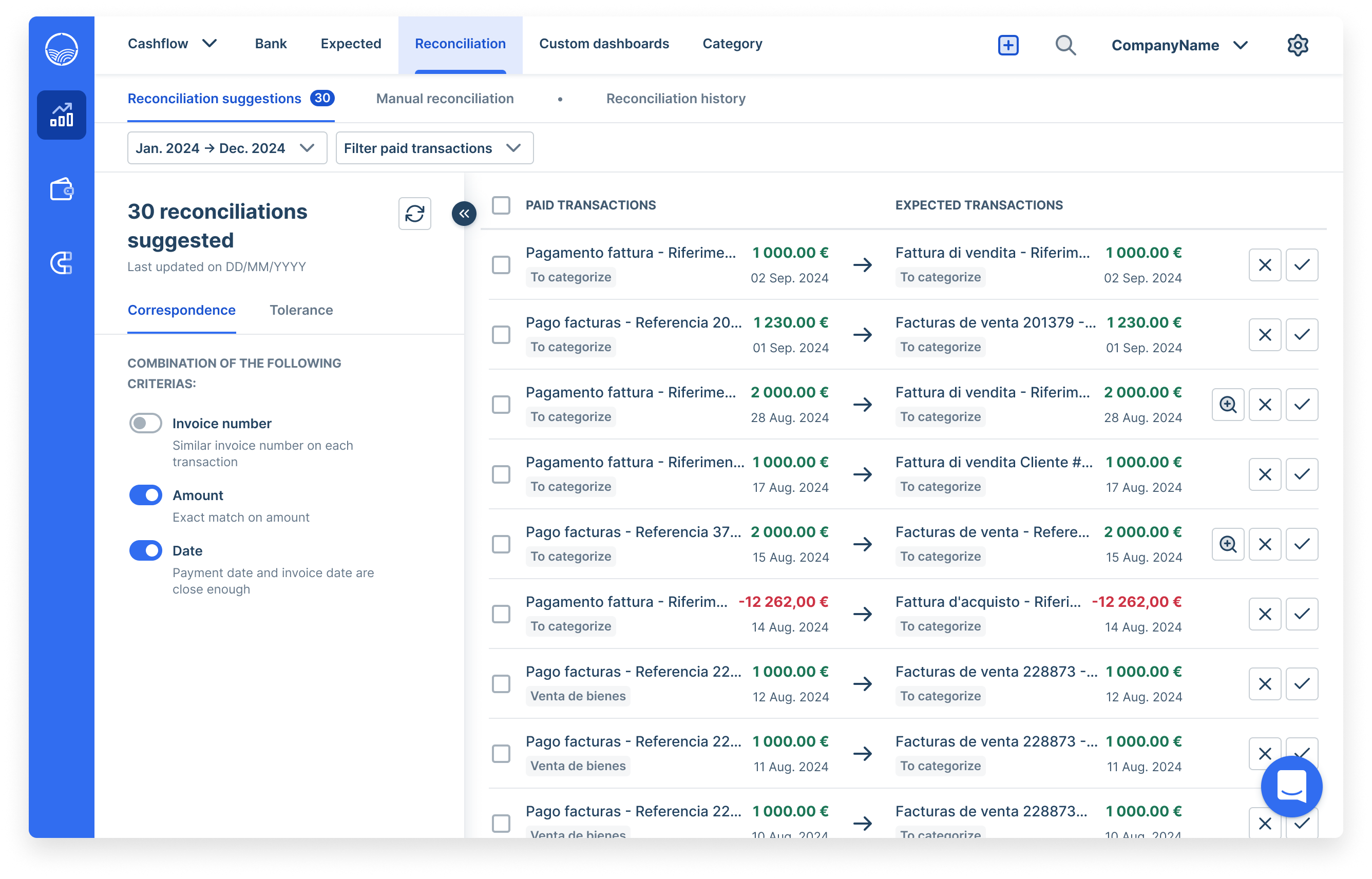
By default, users would land on the Suggestions page, with the goal of clearing their to-do list as efficiently as possible. When a suggestion looks correct, they simply click the check icon — the reconciliation is processed and disappears, and the next one is ready to review.
User testing
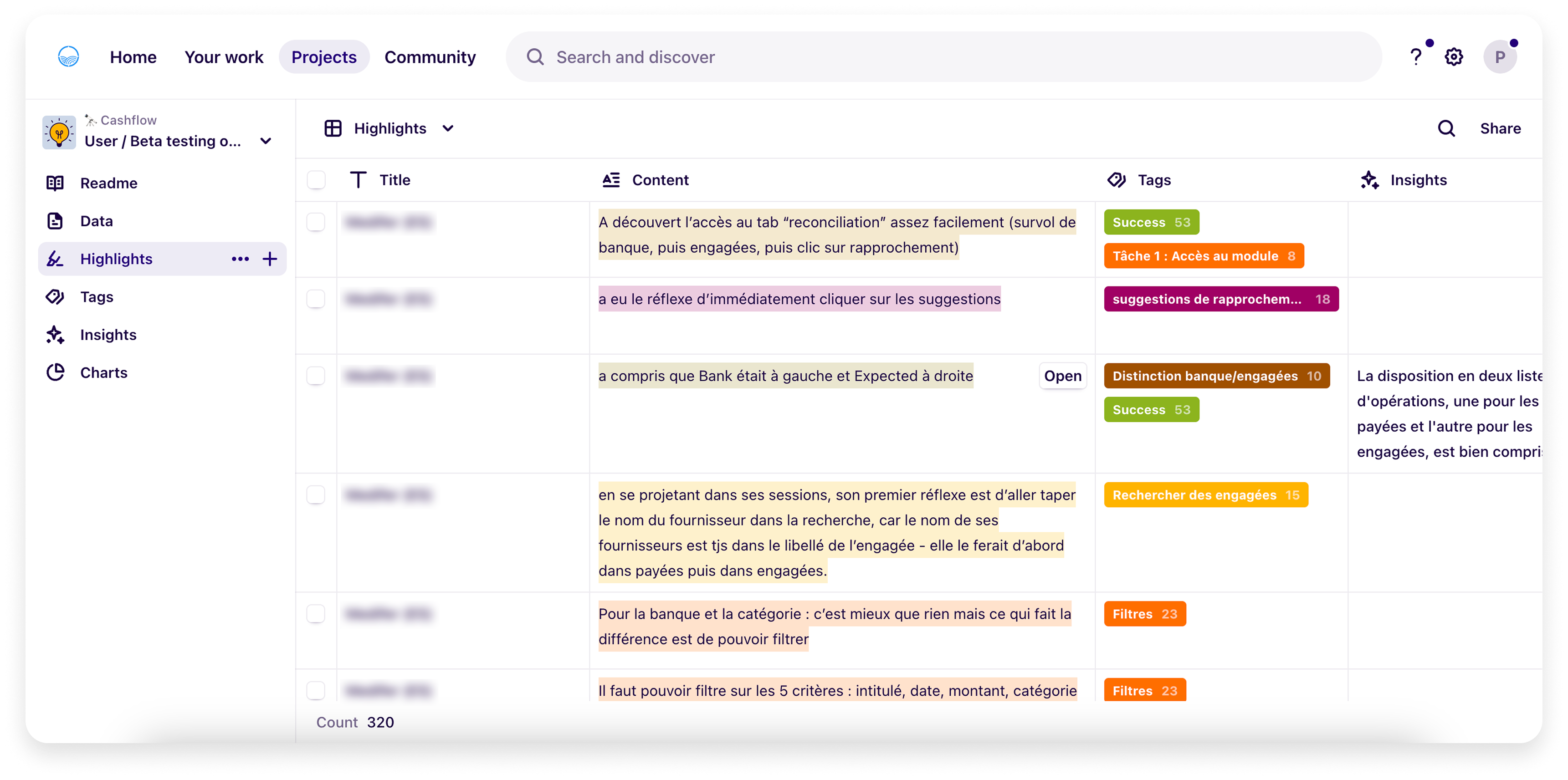
To test our design approach and ensure the new experience met real user needs, we conducted several remote testing sessions with clients, using interactive prototypes. These sessions helped us identify usability issues early and iterate quickly. To guide users through the tests and collect more structured feedback, I also created user guides tailored to each flow, ensuring a consistent and focused experience during the calls. Here’s a look at our data board in Dovetail, the tool we use to centralize user tests. We categorize different types of calls to easily distinguish between client sessions and internal ones. Each test or call is tagged to provide a clear overview of the insights. For instance, you can see here that access to the reconciliation tab was a success for this client.
Key learnings
User testing revealed three major insights. First, the split view layout proved highly effective, helping users process transactions more efficiently by giving them full visibility on both sides of the reconciliation. Second, while suggestions were appreciated in principle, their usefulness was limited by the current algorithm's low accuracy — highlighting a need for technical improvement before relying on them. Finally, the transaction history feature went mostly unused, suggesting it could be removed or deprioritized in future iterations.
Reconciliation module
After presenting these learnings to the tech team, we discussed the feasibility of additional features and aligned on what could be introduced beyond the initial MVP. We agreed on a final solution to move into development: keeping the dedicated reconciliation page, preserving the split view, and removing the history section — which was underused and somewhat redundant with the upcoming bank journal feature. Suggestions were postponed to a later iteration to give engineers time to improve the algorithm. This gave us a focused and streamlined reconciliation space that, when presented to AMs, Sales, and three clients, proved clear and effective enough to move forward.
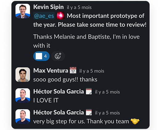
Communication to stakeholders
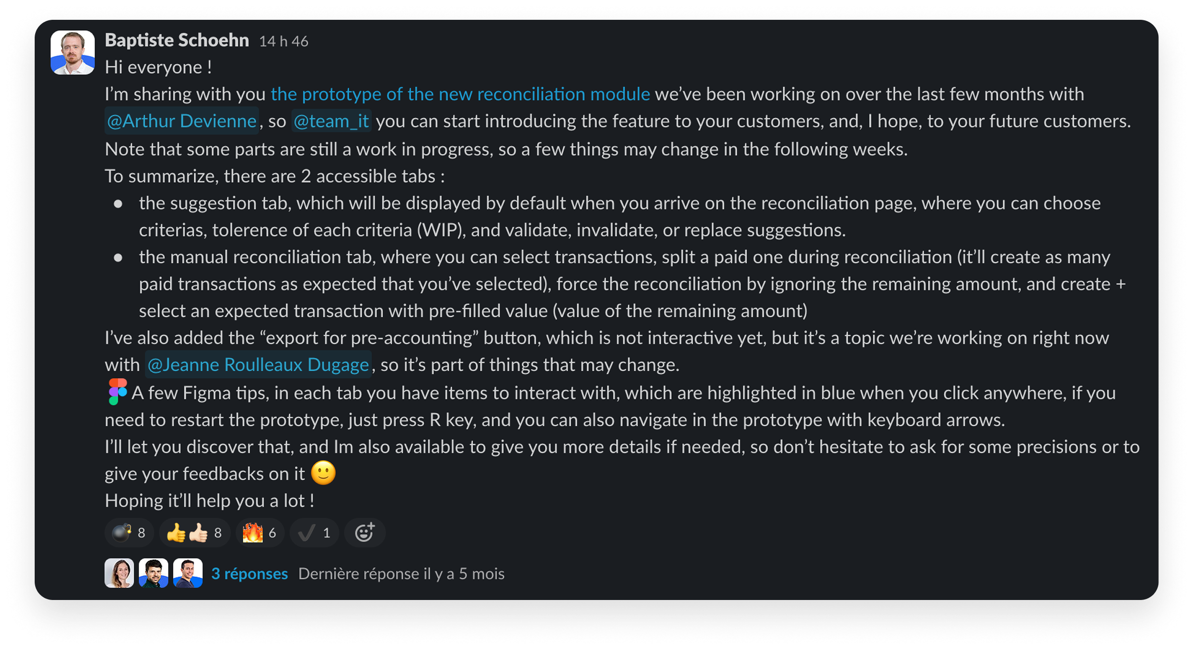
Because communication is a key part of my role, I shared the long-term prototype (including suggestions) with the Italian and Spanish teams via Slack. The reactions were very positive, as you can see above. I also took 15 minutes to present it live, walking them through the Figma file. This was a great opportunity to show my work to the teams, and start showcasing what’s coming next at Agicap, both internally and to prospects — helping to build momentum and support early sales conversations.
What’s next ?
Over the course of two months of development, I closely supported the engineering team — answering daily questions, providing guidance, and regularly running design QA to ensure the final output matched the intended experience. Once the feature was developed, we monitored its impact closely with the Sales team, while continuing to collect insights from our beta testers. From a sales perspective, I remind that the loss had been estimated around €100k per month — a target we didn’t fully recover, but we still managed to bring back approximately €50k/month, which significantly contributed to Agicap reaching a cashflow-positive state. Later discussions revealed that this target had been intentionally exaggerated by the Sales team to prioritize the feature. While I remain critical of my own work, I’m proud of the tangible impact we achieved. We then moved on to building the bank journal feature — the logical next step — allowing users to visualize all completed reconciliations in one place.